Contract: Das Stue, Berlin
Published in Contract, April 2013
Themed décor and blatant animal kitsch might be expected, even desired, in an American hotel situated next door to a zoo. But Das Stue is a boutique property that neighbors the Berlin Zoological Garden, and while Germany coined the term “kitsch,” it’s a country that boasts haute design and architecture devoid of such tawdriness—especially within its capital city. Thus, the collective behind Das Stue—Studio Urquiola, Axthelm+Rolvien Architekten, and LVG arquitectura— approached the project with a modern design sensibility, sparingly inserting tasteful references to the menagerie but ultimately creating an environment that is at once both welcoming and sophisticated.
Das Stue—Danish for “living room”—alludes not only to a home’s social hub, but the building’s origin as the Royal Danish Embassy in 1940. Since then, the landmarked Johann Emil Schmidt structure changed hands a number of times, ultimately becoming this five-star hotel through a three-step process: Potsdam-based Axthelm+Rolvien restored historical details, renovated the interior architecture to accommodate rooms and amenities, and built an addition, all the while combining these elements into a cohesive package. Milan-based Spanish designer Patricia Urquiola designed the public space interiors, from appointing furnishings and art to specifying finishes. And LVG, also from Spain, provided final touches in the guestrooms and suites.
A grand entrance
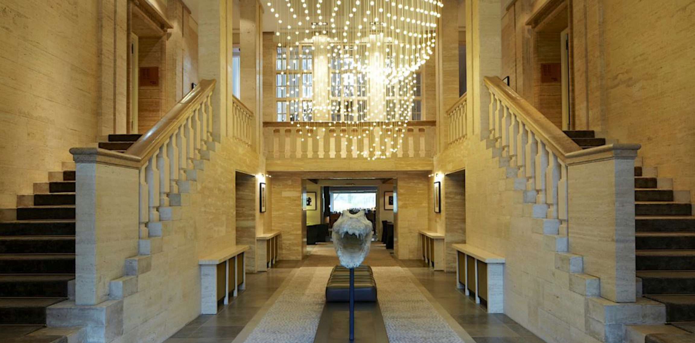
Since the existing building’s curved stone façade naturally made an elegant hotel entrance, the architects and designers left most of its historical details intact. A portico marks the entry doors, which in turn give way to a stone lobby flanked by staircases and discreet concierge desks. It’s here where Urquiola first demonstrates her artistry of fusing together seemingly disparate characteristics: refinement, comfort, subtlety, and whimsy. Carpet lining the steps soften the classic stone staircases, while a rug in the center of the lobby achieves the same effect with a pebbly surface reminiscent of lizard skin. The reptilian theme is repeated in a literally jaw-dropping sculpture—an open- mouthed crocodile by Parisian artist Quentin Garel. And a sculptural installation of small bulb pendants hovers above the artwork.
The lobby offers a unique vantage point: Behind the sculpture, windows and a square wall opening reveal the meeting point of the old and new buildings. Open sight lines allow guests to peer into the lounge spaces of the modern addition and, at the end of that axis, the occasional zoo critter strutting past a window behind the bar.
Feeling right at home
A comfy, residential vibe—albeit more upscale in some zones— dominates the lounge, dining, and general sitting areas throughout the hotel. Urquiola’s furniture designs coincide well with this relaxed sensibility. Her quilted and tufted armchairs and sofas, from Moroso and B&B Italia, mingle with a selection of saturated shag rugs and, now and then, animal sculptures in the lobby lounge. In the existing building’s generously sized stair landings, she complemented the pristine white-painted balustrades, wainscoting, and original parquet floors with cozy furniture groupings and bookshelves stocked with books on design and animals, as well as games to transform the stair into a three-story library and drawing room.
In the property’s three Paco Perez restaurants, Urquiola uses slightly different formulas, but all impart the same cozy feel. The fine dining Cinco features booth tables but encourages communal dining at the center overlooking the show kitchen. Her Nub chairs for Andreu World—a sort of modernized Windsor-style chair—and a canopy of copper pots overhead manage to evoke a pantry setting. The Casual is a skylit, carpeted space outfitted mostly with her upholstered armchair and wingback designs. Finally, a private dining area within Cinco seats up to 22 on Nub chairs and pillow-covered banquettes, though the real draw is its direct views of the zoo’s ostriches.
Rooms with a view
For the architecture of the modern tower, “Our intent was to combine the fascinating qualities of the landmark with a very modern approach of the new tower,” says Henner Rolvien, partner at Axthelm+Rolvien. The architects composed a structure of cantilevered geometric volumes, but applied an unusual exterior treatment to conceptually link it to the historic building: All the concrete cladding of the addition was etched with a custom-designed flocked wallpaper pattern that references classic décor of yore. According to Rolvien, the pattern is also applied to textiles in some of the rooms, creating further connection between exterior and interior.
The interiors in fact benefit from the modern addition’s composition and angles. Das Stue’s 80 guestrooms and suites, many of which are located in the new tower, offer light and exceptional views whether facing the hotel courtyard, the Tiergarten Park, or the zoo, thanks to Axthelm+Rolvien’s thoughtful planning. Finishing out the rooms, LVG incorporated a range of custom and one-off elements that continue Urquiola’s vernacular of understated luxury and modern comfort. Dark oak floors are topped with cozy area rugs, platform beds, and minimalist writing desks. Some rooms feature custom wooden canopies over beds, while others feature photography from a private collection, one-of-a-kind furniture pieces, or freestanding tubs. In the rooms facing the zoo, windows—some floor-to-ceiling—frame views of wild ponies, gazelles, and ostriches. No need for more wildlife references here when the rooms let the animals speak for themselves.
