Contract: Interiors Awards Winner 915 Wilshire Boulevard, Los Angeles
Published in Contract magazine, January/February 2019
It’s a rarity when loss of square footage actually pleases a client, but such was the case in HLW’s renovation of the lobby at 915 Wilshire Boulevard in Los Angeles. “The scale felt too large for no real purpose,” says HLW project architect and interior designer Amy Rangel. “We realized this lobby was only used as a space to pass through, with no meaningful or comfortable place to pause.” In researching SOM’s original 1978 plans for the office building, the project team unearthed a scheme comprising a smaller lobby with a covered entrance out front. At some point, the lobby was expanded, absorbing the outdoor space and pushing the doors up against the sidewalk. It was then that HLW proposed a radical move to resolve the awkward entry: Revert to the original design intent by reducing the enclosed lobby, from 2,300 to 1,590 square feet, to make way for a transitional alcove-like threshold. “From a real estate perspective, we were able to persuade our client LPC West that doing this would dramatically improve the experience of the space.”
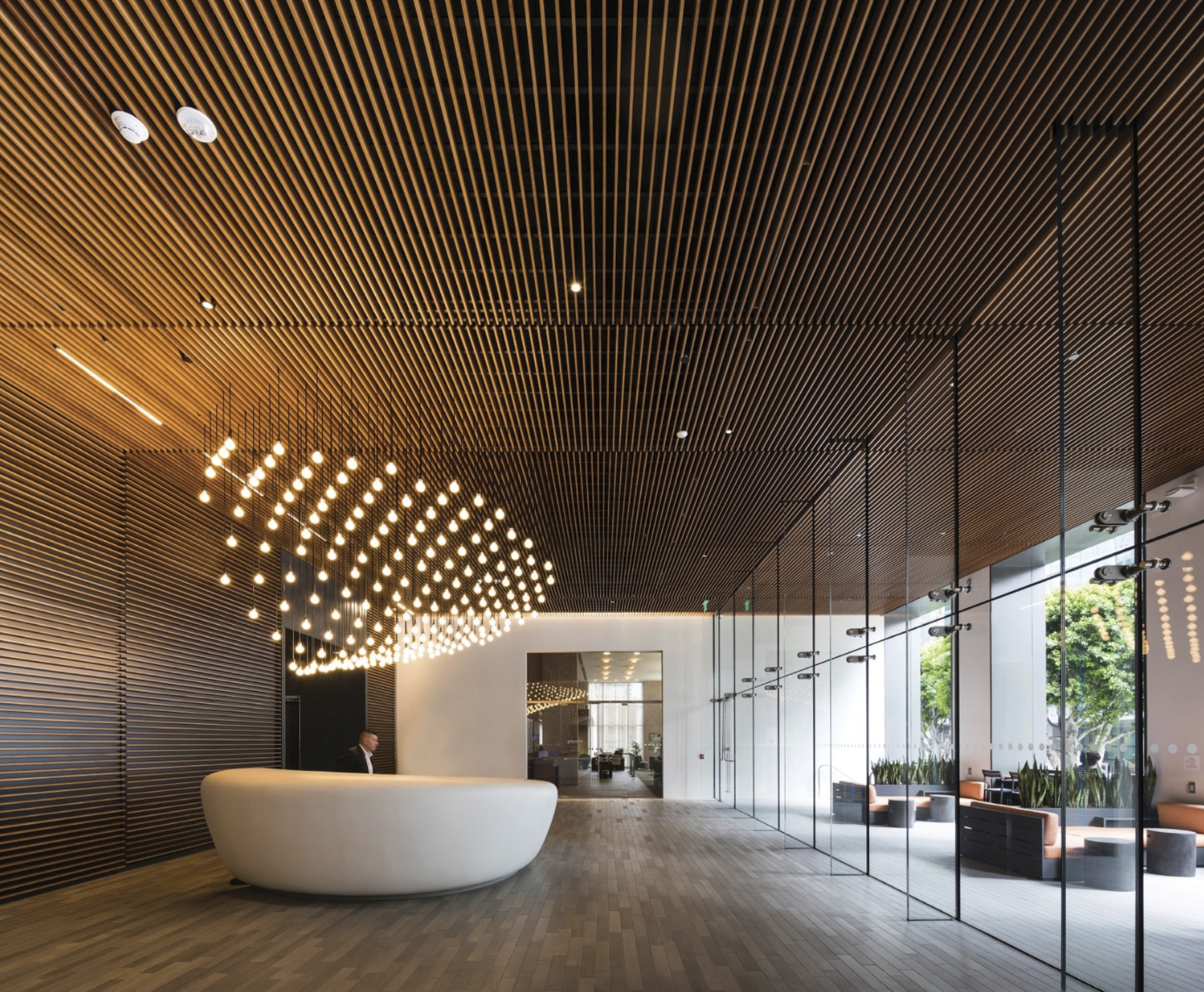
The project team replaced the existing black granite-and-glass entrance wall with a frameless glass curtain-wall system set back to reclaim some 700 square feet of recessed outdoor space, which HLW refers to as the “portico.” A true engineering feat, the curtain wall utilizes continuous glass fins up to 30 feet in height, resulting in a visually seamless flow between indoor and outdoor. This move also cleverly masks the reduced lobby footprint.
The firm employed another strategy to connect the covered entry to the enclosed space: continuity of materials. The old palette was dated and tired, recalls Rangel: “The floors were hammered pink and polished black granite floors, and the walls were clad in deeply hued red eucalyptus panels framed with the black granite, which felt stark and overpowering.” Now the walls sport lighter-hued hemlock slats that also wrap the ceiling and extend beyond the curtain wall to clad the portico soffit. Meanwhile, a warm gray porcelain tile covers the floors both inside and out. these finishes resonate better with office design today, which tends to favor hospitality and residential elements over buttoned-up corporate to create a more welcoming environment.
HLW updated lobby furnishings as well. The custom-designed reception desk “is really only imaginable with the sophisticated digital tools available to architects and designers today,” Rangel says. “The shape is expressed through a series of compound curves, each with its own geometric properties.” Constructed with white monolithic fiberglass composite, the sculptural piece houses wood cabinetry and desk components large enough to accommodate security monitors and keep the reception top uncluttered. “The chandelier geometry was designed using a parametric modeling program in order to directly relate to the desk.” The team then “sculpted” the parametric form above the desk using a grid of 217 pendants dropped to precise heights.
Previously, the lobby had a meager four Barcelona chairs for seating. With the enclosed space now set back, the outdoor portico functions as a waiting area and accommodates more guests or tenants on its variety of lounge furniture. Planters amidst the furniture lend a hospitality-design touch while the façade-aligned floor above shelters the portico from harsh sun and inclement weather. “This is the only office tower lobby I am aware of with a 100-percent outdoor lounge area that still feels integral to the lobby itself,” Rangel says. “This feels different from the office plaza typology prevalent in Los Angeles.”
